How we redesigned the brand page for MISURA
In 2021, we created the first brand page for the MISURA brand at misura.cz (later misura.store). We wrote about the creation of the first MISURA brand page in our case study. The goal was to build a site that would introduce the brand to the public, promote brand credibility, get results in organic search and support the misura.shop e-shop.

The original website from 4 years ago fulfilled its role perfectly. Thanks to constant work on creating explanatory content, dynamic product boxes and for example our own database for configurator management, we have managed to make the MISURA.store brand site both a valuable source of information for MISURA customers, but also an important resource for boosting organic purchases.
Why did we decide to redesign?
We decided to redesign the MISURA.store website together with MISURA's managing director and majority owner Jiří Mihel because:
The content had outgrown the original website
When we launched the first brand page for MISURA, it was the beginning for both the content and the brand itself, and a lot has changed since then. The number of products has grown, dozens of articles, tips and real customer stories have been added. The original site wasn't ready for that amount of content and became oversized. Key content was not being displayed and the overall information architecture did not reflect the current needs of the brand or customers. It was time to redesign it.
A shift in user perception of quality
Now more than ever, people judge a brand's credibility and quality by their first impression of a website. Graphics and user interfaces need to match current trends to build the trust needed
MISURA brand development
It's not just the market and customer needs that are changing. MISURA itself is also changing. Today, it's no longer just about product manufacturers, the brand is building on technology, working with AI, deploying its own chatbot to help customers navigate the wide range of products on offer. It collaborates with experts from different fields - from marketing to design. And at the same time, it offers products and solutions that these professionals use every day. The brand needed to mirror this new level in its website.
How did the redesign process work?
- Moderated discussions over expectations for the new site. Participants were, at the request of managing director Jiri Mihel, customer and product support for MISURA and the content and development implementation team for TRITON IT. Furthermore, graphic design and marketing suppliers.
- The analysis of data from Google Analytics, Search Console and other user behaviour highlighted the strengths and weaknesses of the original website and supported discussions about its future function and design.
- The analysis of user needs was based mainly on the user support experience and provided information on what products customers are most interested in, what they most often ask about, what they point out that they cannot find on the brand site, etc.
- The design proposals in Figma were projected by the individual graphics suppliers. Jiri Mihel decided to change graphics suppliers in the course of the project. And Miro Hranicky became the final designer.
- The final implementation was carried out by the TRITON IT team, taking into account all the lessons learned.
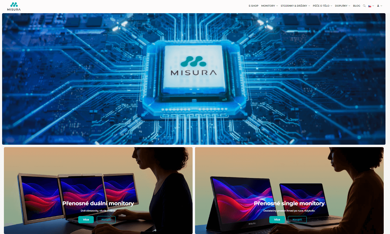
Miro Hranický was inspired by the Apple brand and used the bento box design for the new look of the MISURA website.
What is a bento box?

A bento box in web design is a style of content layout that takes inspiration from the traditional Japanese bento box, where individual food ingredients are carefully separated into small, visually balanced compartments. In web design, this approach means that a page or application is divided into several distinct panels or "boxes," each representing a specific feature, content type, or action. Visually, it looks like a clear mosaic where everything has a clearly defined place. This approach helps users quickly understand the interface structure and improves usability. A typical example of the use of a bento box is the Windows 11 operating system interface, where the Start menu is divided into tiles, or Apple's website.
Technical features of the new brand page
The new website is more visually appealing and technologically advanced, for example:
Full integration with the e-shop
The website is fully integrated with feeds from the MISURA.shop e-shop. It automatically pulls information and data into product boxes, so everything is updated in real time without the need for manual intervention.
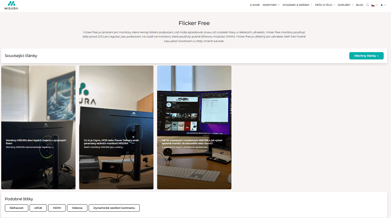
Label system and glossary
We've created a tag system that allows us to incorporate individual articles into thematic categories and helps users navigate the large amount of content we create for MISURA. Each label is also mirrored by a glossary, where users can quickly learn more about, for example, the parameters of MISURA monitors and other technical terms directly related to MISURA products.
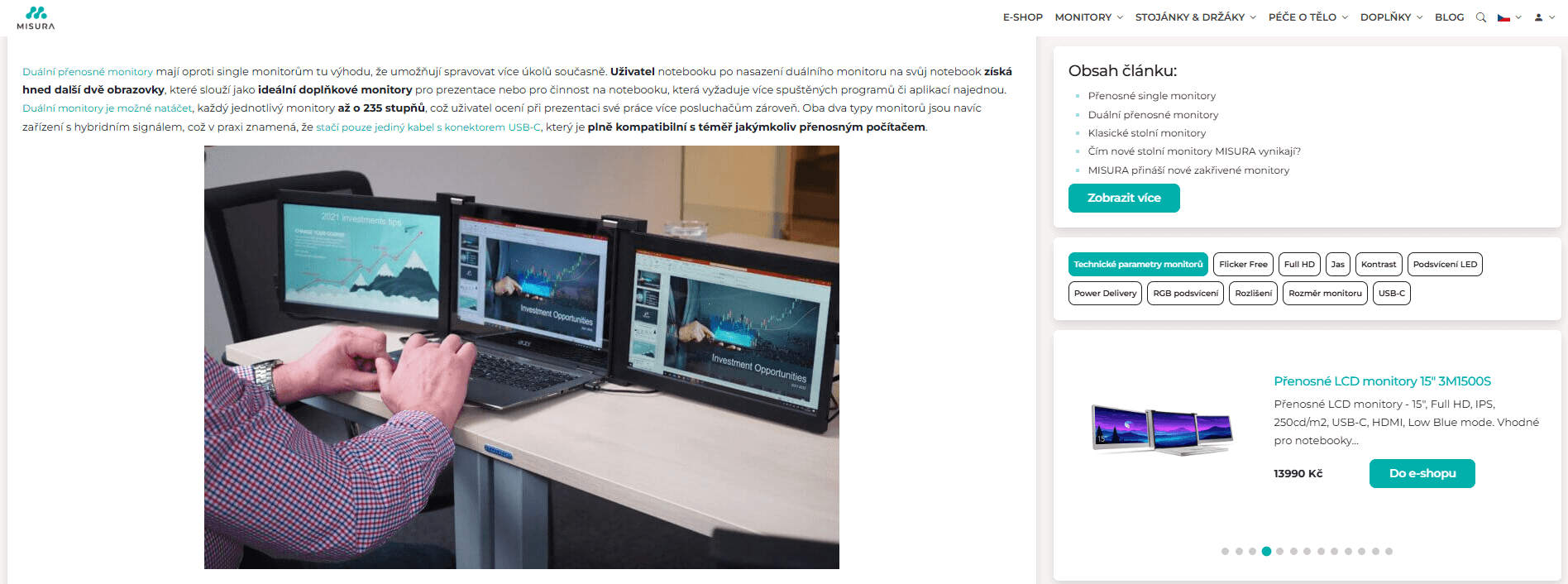
Smart product boxes
Articles introducing MISURA products or advising on their use are an important source of organic visits (SEO) as well as a source of information for large language models (GEO). It is in these articles that it is crucial for us to get the visitor to the e-shop quickly directly to the related product(s). That's why we have linked boxes with related products to the articles. The synchronization of the image, description and price of the products in the boxes is already done automatically from the product feed, as well as the translations.
Localisation to dozens of countries
The content is localised and translated into more than ten languages, reflecting the number of countries in which MISURA sells its products.
AI-powered translations
We have created an efficient website translation process based on the DeepL tool. This process minimizes the involvement of human labor while maximizing the quality of the output, including the correct localization of important keywords in each language. Spot checks by native speakers confirmed the high standard of translations.
Web performance
Responsiveness and interactivity are now commonplace. However, the speed of the website is equally crucial to its success with customers. The website is fully optimised for all devices from mobile phones to large monitors. With an advanced design with an eye for fine detail, this was the right challenge for us. Despite the presence of lots of graphics and an introductory brand video, we got the site into the green numbers in Page speed and improved its performance over the previous version. We just tested the site on various MISURA monitors (different sizes and resolutions), Apple and Android mobile phones, laptops running macOS, Linux and Windows and all the most used browsers.
The original site served us well for four years, but we knew that if we wanted to grow and compete with the world's best brands, we had to move with the times. The new site isn't just prettier - it's a comprehensive tool that provides an even better experience for our customers and helps us communicate the value of our products more effectively. I'm delighted that the Triton IT team and I have decided to embark on such an ambitious redesign.
What does the new website bring to customers?
The new MISURA.store is faster, smarter and easier to understand. Customers appreciate:
- Modern interface - clean design inspired by the modern concept of bento boxes
- Speed and responsiveness - optimized code ensures maximum site performance on all devices
- Better orientation - content is logically divided by topics and products
- Up-to-date - automatic connection to the e-shop ensures that all product information is up-to-date
- Smart assistance - AI chatbot in several languages can help not only with selection but also with common user questions about products
The new MISURA.store website is an evolution of the successful brand page concept. It combines proven principles with current trends and technologies, creating a platform ready for the next years of growth of this Czech technology brand.
Want to improve the design and information architecture of your website?
Related articles
COLORIT is one of the long-established players on the Czech B2B and B2C market for paints, varnishes and sealants. Its position has not been...
Libeřské lahůdky offers its delicacies in 21 shops not only in Prague, but also in České Budějovice, for example, and new branches are regularly...
Saleor is an open platform written in Python that provides a complete backend for creating an e-shop and implements all essential processes,...